
Mar 23
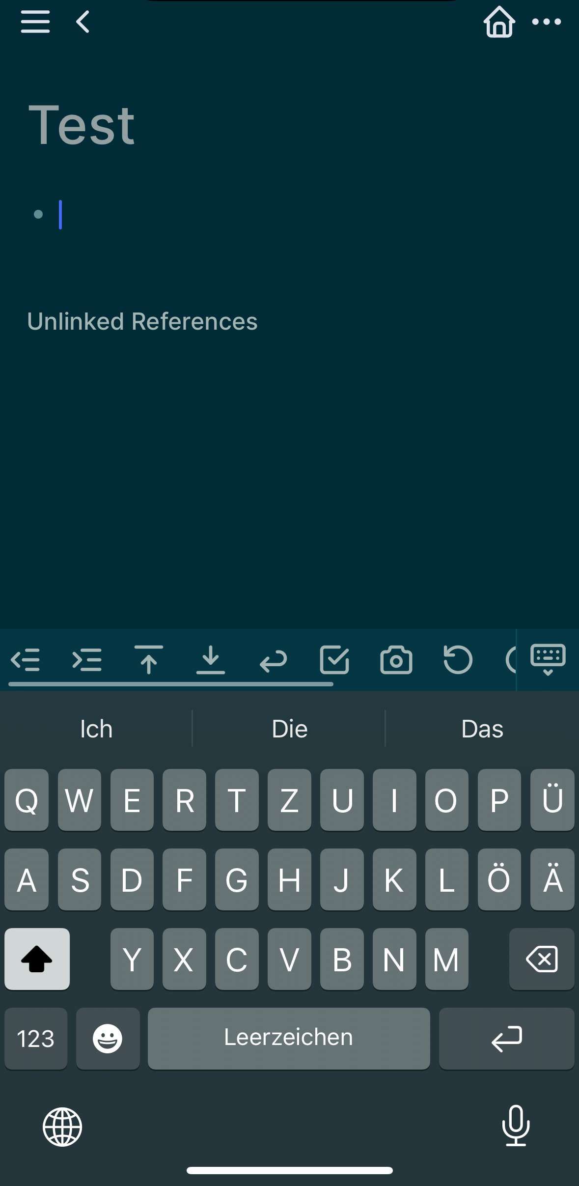
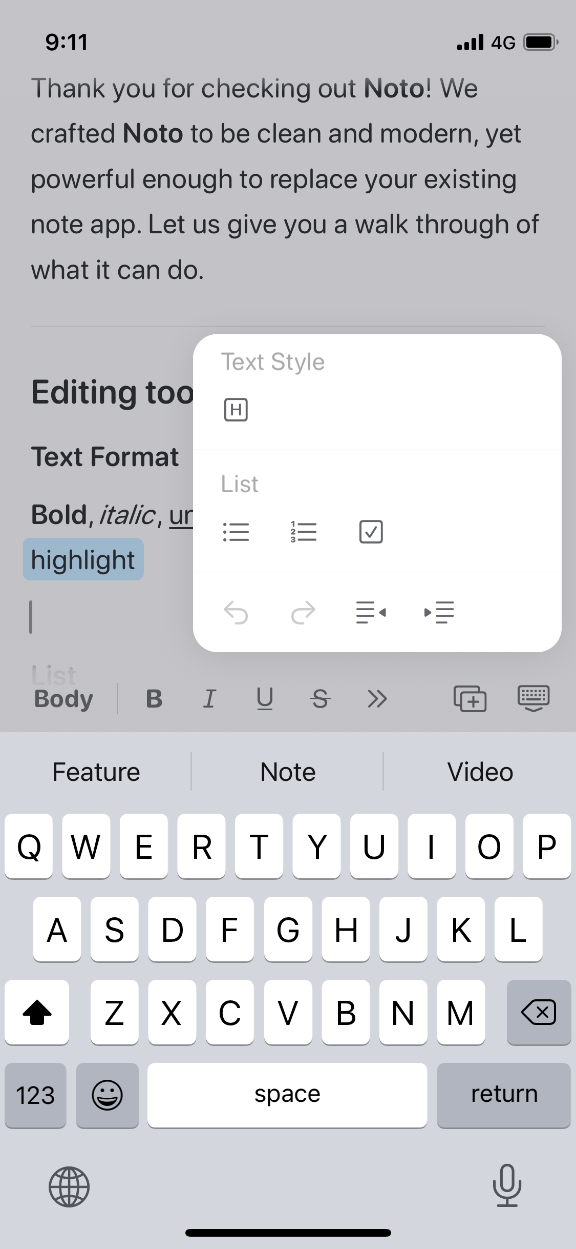
Customize iOS Toolbar
So that you can re-arrange the icons to display the often used ones more on the left and can access them without scrolling.
Related: [Reddit Post](https://www.reddit.com/r/noteplanapp/comments/m738vj/feature…)
Pending
I like this UI from Logseq, where the icons are a bit tighter, and you can scroll left/right to access more tools. I would arrange the ones that I need the most to the left.
Eduard Metzger this feels even more important now that we have the new iOS toolbar which has moved quick access to # and @ into additional clicks which interrupts my flow and slows down quick entry significantly. i _never_ use undo/redo, so putting # and @ into those slots would make a WORLD of usability difference for me. But I suspect that maybe some people actually do use undo/redo, hence my request for customization. Even if it’s only these two slots (undo/redo) that are swappable with only (# and @), that would be HUGE and JOYOUS.
Jody Caldwell: Thanks for pointing this out! I see the need for that!
Really need this! Obsidian has this feature But I think we can make it better Noto’s UI is good looking Maybe you can check it out
There might be some other solutions that could be implemented. I couldn’t figure out how to reschedule tasks because I was coming from Things App where you long-press to get cancel. I assumed a long press would bring up cancel and schedule. Having them appear in the toolbar works but could be more obvious. A color or contrast slide-in animation would help. But, long press would be even better. Drag and drop tasks would free up two buttons as well.
Important because the current toolbar hides things I use: Insert Image to give me things I would never use LLM. (I understand why you added it in there, this isn't a criticism).