
Mar 23
Folding for Indented Tasks and Bullets
Completed
Eduard Metzger U R DA 💣
<3<3<3<3<3<3<3<3<3<3<3<3<3 Thaaaaaank you so much Eduard! This was my most wished for feature for years, it will improve my focus a lot! So good!
Super excited!! Thank you Eduard! It needs some work on whats happening when clicking to complete a folded parent task.
I have tested Mac, web and iOS (iPhone and iPad). On Mac - what Haris said. You can click-circle-to-complete ("CC2C") when it's unfolded, though they don't show that in the vid above. Just not when folded. If you select the arrow button (left of chevron) and choose Complete Task there, it has no effect. On iOS, CC2C (which is really a tap) provides haptic feedback on iPhone as if a complete is being recorded, but the complete doesn't happen (no checkmark). No haptics on iPad so just no CC2C folded. On *web* folded CC2C **does** work. Syncing of completed and folded states seems to be good among these three platforms. I have noticed my Mac beta crashing a couple times during these tests. Many thanks for delivering this feature!!!
Mark Permann Thanks for the feedback, fixes are up!
Haris Sav Fixes are up!
Fixes are working well in all platforms thanks!
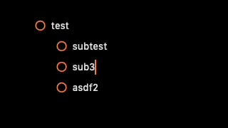
Eduard Metzger thank you Eduard!! Here are some extra tests for some more refinements. Using only keyboard shortcut to mask as done/undone tasks. When everything is open, everything works properly. Thats ok and fine for me. Personally, at least for now, I will use folding to fold either done or undone lists that I dont need to cope with right now. If I would like to check or uncheck any task I would like to unfold , do what I have to do and fold again. Moving on with the gif. A peculiar thing happens if you try to un-done a folded task. It checks the task in a previous line, if you input the keyboard shortcut after the "..." (folded sign). If you input the keyboard shortcut before, it checks the task in line, although by putting the completion date at the last task of the list. With checklists it seems to work more properly. (Of course here by default there are no completion dates)


Haris Sav Thanks, I can reproduce it. Happens with the done tags being inserted somehow and changing the cursor position.
Beta is up! Looking forward to your feedback.
Added all three buttons as supported when hovering. I think that's the cleanest solution so far.

Eduard Metzger, love it! Ship it!
Eduard Metzger Thats perfect! Been waiting a long time for this! 😅
Eduard Metzger Love it! When will this be released for the beta testers?
Michael: As soon as Apple approves the beta. Code is done, uploading now.
You could place the chevron/folding-button on the right side (behind) of the "mother-item".
We got the first implementation ready! But need some feedback. Normally, there is a "chevron" button with which you can fold or unfold a line, like what we have with headings. However, with tasks we have the arrow button which has various features behind it, like scheduling, recurring tasks, etc. The question is, where should we add a folding button? Right now we have added it to the drag button menu just to have it somewhere. Any ideas are appreciated!

Eduard Metzger, I prefer the chevron to the ellipsis. It's a standard indication of a toggle across the apps I use. It would look fine outside of the drag button. My recommendation would be that it would only show on hover when expanded and always show when there is a collapsed section.
Eduard Metzger, I agree with Ryan. I like the chevron.
Eduard Metzger The chevron would be great indeed.
Ryan White: Thanks for the inputs. Just to clarify, with ellipsis you mean the drag button? The 6 dots. I don't think we should replace them with the chevron, but maybe I misunderstood. The dilemma is that we have the arrow button there for scheduling, which is also important especially for new users I guess. We could move that to the right of the line though on hover. That's the best option so far without hiding anything. You would replace it completely? The -> with > (i.e. no scheduling menu, just collapse/expand)?
Eduard Metzger Maybe we could replace the ellipsis with the chevron, and let the chevron handle both collapsing *and* dragging functionality? If that's not A) a huge hassle to implement or B) a horrific UX. Edit: Oh, I just saw your comment above. I still vote on replacing it ✋😄
Eduard Metzger: This is what I was referring to as an ellipsis. I see what you mean with the existing arrow. I don't use it much because I tend to do most of my tasks rescheduling on my phone late in the evening, but it is a nice feature. I do like the idea of moving the existing arrow to the right of the line with hover!

Eduard Metzger The folding toggle is **much** more useful than the current schedule arrow, as shown in the initial version of this, which I received via email I assume when you first made your post, rather than the version currently embedded above which appears to be updated to retain the scheduling arrow and only show folding via an end-of-line ellipsis.
Ryan White Oh that one, got it!
Ryan White I also like this idea. The existing arrow to schedule should be on the right side
Eduard Metzger great addition, one idea for desktop would be to let users pick on of these actions as a default when double clicking on the “drag” button, so that I can pick toggle as a default and therefore very quickly toggle sections by double clicking. If I rarely use it I might want to switch that behavior to schedule instead. On mobile however I still think the chevron would work very well (as in Apple notes, bear etc), as none of the other elements are currently being displayed
Eduard Metzger alternatively for mobile I could also imagine an intuitive interface to toggle a certain task / paragraph by swiping up (collapse) or down (expand) on the given line (without force pressing, which would trigger dragging). In combination to swiping right (indent) and left (outdent) like in Apple notes I believe this would make for a very fast and intuitive user experience without cluttering up the limited screen space with toggles everywhere
The fact that this works on the web app and not natively on mac or IOS is such a tease 😂
It works on the others also, but you have to use TestFlight. Do a full backup first (File menu or Preferences). Google "Noteplan Testflight", that's how I got a link.
Eduard Metzger do you happen to have any updates on this? It would be great to know whether this is coming any time soon. 🙏
Pretty Please
I'm begging that we move this up the list. Please, please!
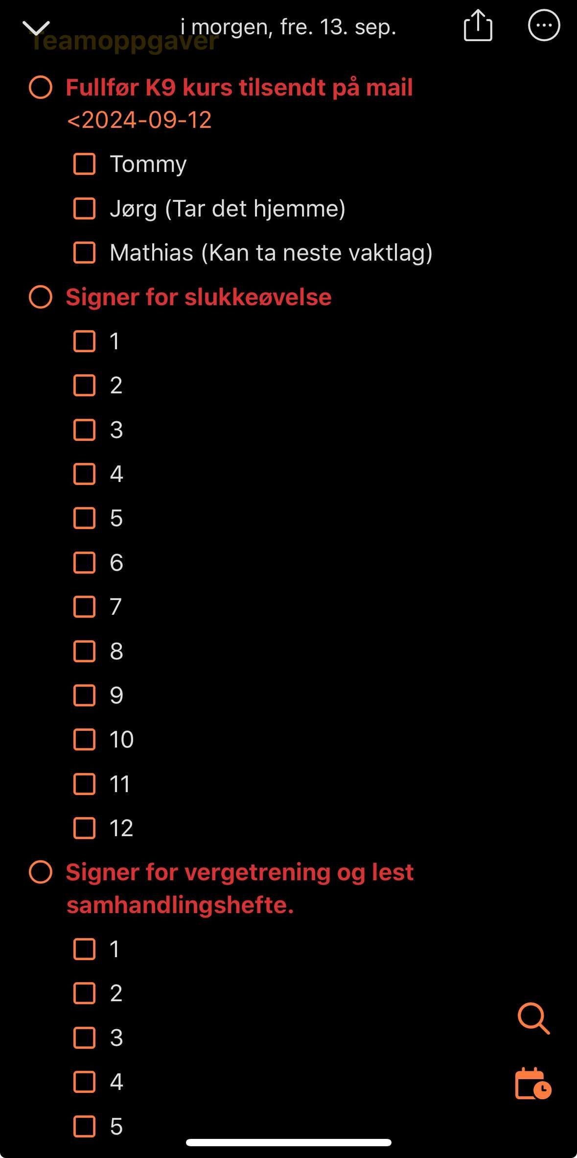
Again, collapsible bullet or tasks will be so usefull. I attached a screenshot with 3 tasks regarding getting my team to do something. I have 12 people to manage, so I often have 12 checkmarks below each task.
I would like to be able to collapse everything with indented sub-items. This is not possible with tasks, checklists or bullet points, but it makes my notes unnecessarily long.
+1 for this, Eduard, please! Adding this would also allow notes to act like one of the many outliner applications, but with more power. It's not just about cleaning up the note visually, but about focus. I need to be able to quickly focus on what's needed at the moment, and I find myself having to scroll through quite lengthy lists to get to the thing I need at the moment. If I could fold away the detail on things that are less relevant now, that would be a real help.
Jon You are absolutely spot on. It's about focus.
Please make this a priority as it will clean up the daily note a lot! I find myself not wanting to add a lot of information indented under a task or bullet because it clutters up the daily view. When I used roam I would take a lot of notes and tasks under a bullet and just collapse it to one line! That is an amazing feeling😊
Tor-Einar Rogn Same here! As my Daily Note grows larger throughout the day, my anxiety grows along with it. Because I know at some point some information is going to get lost in the mountains of bullets and sub-bullets I have. I never thought about trying those bullet-based apps like Roam because Markdown is important to me (I *need* to be able to write paragraphs, code blocks, etc). I just can't see myself being restricted to using *only* bullet points like how those apps are structured (unless I'm mistaken?) So I think NotePlan adding this as a feature would be a real game changer.
Is it coming anytime? It's in "planned" longer than some of the other features that are being implemented right now and it seems planned is not planned but rather general todos? Love your app and appreciate your work, I'm just holding my breath for this since folding is really missing 🙏🫶
David: Yes, sorry, holding this off for so long, because it seems more complicated and scary than other features. But it's still very relevant.
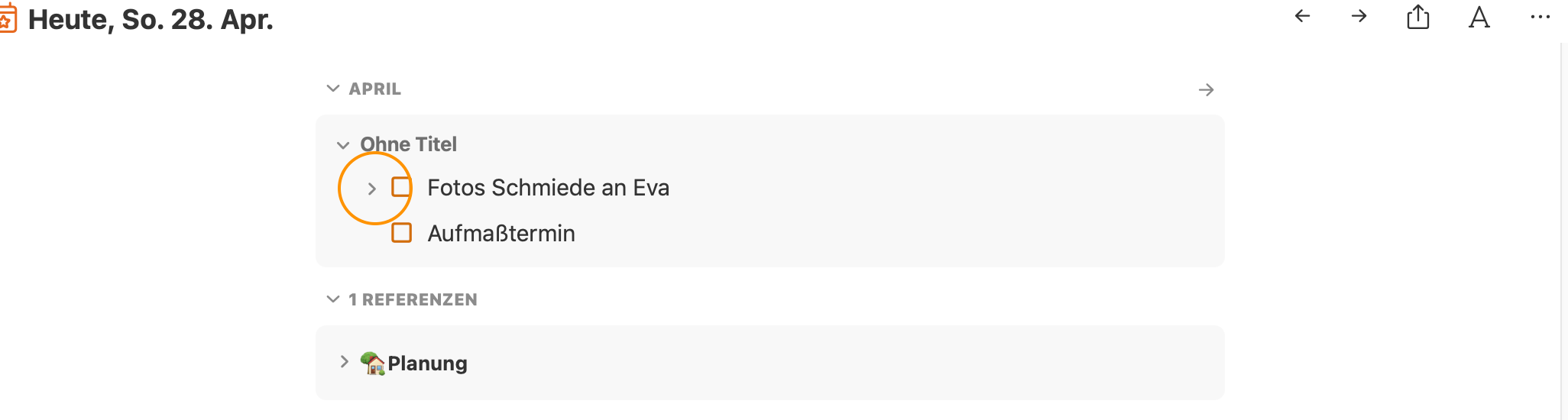
Eduard Metzger still don't really get over the fact that you implemented this request in the reference view above daily notes but not in the daily note itself 😙 I wish I could do swift just to support tackling this
David Thanks for the reminder. It was way easier there than inside the editor. But it's still something we definitely want to implement. If it would be just easier, but no worries.
Eduard Metzger I can wait, but I realized that essentially I'm shifting my whole system gradually to use monthly view for my tasks, only to have folding in daily notes because I'm easily overwhelmed by the long lists and have a hard time to find focus. For people with attention problems it would be really helpful to be able to declutter. Also I keep longer writing and notes in Evernote more and more because of this. <3
I would use this feature a million times per day. It's so handy to be able to focus on a section of your document this way.
Can this feature go for attaching images as well ? Just so it won’t take up all the space in a day view
Specifically I am always wanting to collapse indented checklists into parent tasks. Using headers is too clunky for this. Being able to collapse indented tasks globally would be wonderful.
This would be a game-changer for me and allow me to get a lot of my workflow and outlining out of Workflowy
Is it done yet? Not saying we're impatient but... NotePlan has become central to everything else I do, so a step closer to software perfection is always a good thing. No pressure Eduard... 🤣
Eduard Metzger Please add folding of frontmatter when you are doing this. Frontmatter should be folded by default (show title only if there is one -- sometimes isn't). Example of the ugly frontmatter in every one of my daily notes. :(
David Wertheimer: oh yes
Will this be similar to Craft toggle?
Plus one for this — It’s probably the biggest feature I’d like to see implemented, just to help keep focus in daily and “planning” notes. It’s the one feature that keeps me going back to Obsidian (everything else is just nice to have)
Is this still planned? Would love to see it!
just to make sure the standard macOS "fold/unfold all when clicking with the option key pressed" pattern is included here (as it is the Notes explorer in the sidebar) 😅👍🏼
Can we have the zoom-in/out a bullet item keeping the context information like also Workflowy does? :) Thanks!
I am probably in the minority here but I actually like that NotePlan DOESN'T fold. I would want folding to be enabled/disabled on a global level.
atlgc Maybe you could just not use it?
I would love this feature. This is the main way that I use folding. I rarely use folding with Headers. I mainly use bullets for indenting and folding.
Joseph Wood: Same. I only use folding in headers to collapse weekly view sections in my daily notes.
Let me jump on the bandwagon with this. I have very long notes with nested bullets. I would love to be able to fold them. To use a header doesn't really work out well. Basically any bullet with nested (indented) content should be foldable. Or create a toggle list feature. That would work as well.
It would also be great if the indented bullets/tasks went along with the header to do when you did a drag and drop with it.
Ed B: +1 - I always drag a top level bullet expecting the nested ones to come along and end up undoing, selecting nested bullets, and dragging again.
Ed B: I agree—I always expect indented bullets to work more like OmniOutliner, where the child always moves with the parent
Ed B: Agree, same here. I want the indented bullets/tasks to go with the parent
+1 For folding bullets. Would love if it worked similar to dynalist. Folding headers is great, but doesnt always work since you need to have another header under it to prevent folding everything below it. Bullets would be great if they respected indentation. Would also be great if it was supported in tasks as well. When calling a paragraph via a search, it would be nice to have control over whether you return all child content. In other words, a solution might be to expand bullets in search to reveal child content.
Eduard Metzger I'm not sure what direction you're thinking about in terms of folded tasks/bullets within References, and I'd love to hear your thoughts! I would love it if it were possible to have the ability to display more granular information in the references and expand/fold within the references area as well. Similar to how Roam Research handles that, IMO that is the best approach so far. I find that with NotePlan I often have really long references and the expand/collapse all isn't sufficient to maintain the most important things visible. It would be really great if we could filter or hide certain parts within the references area, and I hope that this folded structure is also considered for this. Is this something that's on your mind for this as well?
Daniel Danilov: Thanks for your comment, good points. I noticed, I didn‘t elaborate where exactly you will be able to fold tasks. This feature targets mainly tasks inside the note. So you can optionally hide subtasks below a main task, similar to folding headings. But your point about references is valid as well. There is indeed also a need to show subtasks in the references, however, it would also clutter more. Probably „expand all“ should not expand subtasks. A filter is also a good idea to limit the amount of references. Especially for completed, canceled or scheduled tasks (we don’t need to display those references all the time). Did you mean something like this? Like filtering by the state of the task?
Eduard Metzger: Thank you for sharing! I have a lot of thoughts about this, so I'll try to be as succinct. My concern is more focused on how references will handle this expansion and any future sub-items. If you've used Roam, you'll notice that you can easily expand sub-items within the references themselves, saving you time from clicking elsewhere. The other concern is tasks, completed items, and anything that one might choose NOT to see at any given time. I often want to track information about people (and I have a note for each person), and see all that information in the references. This is super helpful for team leads who manage people to keep everything all in one place. However, between weekly notes, assigning them tasks, and personal reminders about them, any action items, etc. can quickly become super messy, and extremely long, blocking the whole note itself. There are some possible solutions I think would be a great addition. 1. Allow (even if fully manually) to "hide" any specific part of the references. For example, that could be completed tasks, specific lines, a heading and everything that goes under it, any references from daily notes. They're simply removed from view, and could be expanded later (e.g. with an unhide button). This can help only keep the most important information in the references, and still look up at all the details if needed. 2. Tasks in particular can be tricky to handle, but completed and/or moved tasks should not be there. Especially if it's a recurring task, or one that has been moved several times. The mention would still appear multiple times, which is not helpful. The solution from #1 can also help resolve this. 2.5 A very interesting solution you might consider is separating tasks from references. I saw this in some app (I can't recall the name), and it worked quite beautifully. When there are tasks assigned to a specific day, those are displayed in a separate references area, which both highlights tasks and makes managing them easier. They also allow rescheduling from that secondary screen, too. 3. One particular area of struggle with References in NotePlan is that it's far harder to track things. For example, I like tracking potential [[Problem]]s that I could write about in the future. Each one of them is accompanied by a solution (see: https://d.pr/i/t74T0Y/H3oO6WpJSW). Now, if I want to bring this up in context in the future, there's no way for me to do that besides going back to this specific note. Scenario A and B: click on [[Problem]], and I cannot expand to see the related solution: https://d.pr/i/22A9HA/mMGQvH2Ehu or the quote that results in this problem/solution. The reverse of that is also true, if I look at the solution, I cannot see the related problem. Scenario C: I click on #quotes, and I cannot see the related problem or solution, or even the title that it comes under: https://d.pr/i/9bIMCE/wDvO6eCVpP In comparison, here is how it looks in Roam: https://d.pr/i/LgOpri/hx5QALuk93 Essentially, even if you track information well and tag it and give it links, it's still very difficult to see all of that information together. I think the best solution for that would be to allow expanding/hiding/removing specific aspects in the references area, and to expand on that. It wasn't as short as I hoped it would be, so thank you for reading through it, I hope it's helpful and I'm more than happy to chat through this more with further examples if you're interested. 🙏
Daniel Danilov: Thanks a lot for elaborating on this. I think this feature doesn‘t go as far as in your comments, it revolves primarily around indented bullets inside the editor, less in the reference area, but I know what you mean here. Filtering the reference area, especially in regards to tasks is a very good point. I‘m not fully grasping how Roam is handling the collapse/uncollapse of related items which you were showing in the screenshots. Would you be open for a short call where you can show it to me on your screen? This would help me a lot!
Eduard Metzger absolutely, I'm happy to jump on a call to talk through this, feel free to schedule a slot here (this will create a calendar link and Zoom link automatically): https://calendly.com/danieldanilov/conversations It'll block off 30 minutes for the chat. Looking forward to it!
Daniel Danilov: Thanks! Scheduled for tomorrow if that works for you :)
Planned for the release after the upcoming one.
Eduard Metzger Will it be possible to use keyboard shortcuts to fold and unfold indented tasks and bullets?
This should be merged in with: https://noteplan.canny.io/general-feature-request/p/fold-ind…
It would also be great if when you indent something, Noteplan would treat the sub-items as "attached" to the one above it as well. So if I move around the top item, the indented items go with it. You can accomplish this by selecting the items and moving them as a group, but it would be great it thought of them as one item or had them connected in some sense.
Damian Roskill: I really like the idea of the relationship between the item and its sub-items influencing the behaviour of other features in NotePlan. Building on your example where the sub-items are automatically moved with their “parent” I suggest that searches could also be tweaked. So for example, if the parent is identified in a search because it has a particular #tag or is overdue the sub-items should also be displayed as a collapsed group. Today I had a situation where my parent item is “inform people we have bought a different house” and one of the sub-items is “removal company”. They are both tasks that appear on the overdue list but they appear in different places without any indication that they are related. The “removal company” would have been much easier to understand if it had appeared in a group below the “inform people we have bought a different house”. It might take a little bit of thinking about but I also wonder whether the parent should be displayed when only the sub-item meets the criteria, eg because the sub-item is tagged but not the parent?
It would also be great if when you indent something, Noteplan would treat the sub-items as "attached" to the one above it as well. So if I move around the top item, the indented items go with it. You can accomplish this by selecting the items and moving them as a group, but it would be great it thought of them as one item or had them connected in some sense.
Please also add indent / outdent together like mentioned earlier: https://youtu.be/qxCC5unNnLE
Making the bullets work like workflowy would be great. I enjoyed the ability to zoom/focus in one bullet point in workflowy and it was difficult to migrate all my notes to NotePlan to use it as the main note taking tool.
I think it's not just folding. Indented lines should be connected across all actions e.g. indent/outdent together, grayed out if parent task is completed. Inspiration from Roam: https://youtu.be/qxCC5unNnLE
Also that this is copied across with the task into the target date note - it is usually useful context or details.
TaskPaper might provide some inspiration. https://www.taskpaper.com/guide/using-taskpaper/fold-focus-a…
Available now with v3.15 on the App Store.