In migrating from Apple Notes to Obsidian to NotePlan, I have a collection of 35 top level folders and a couple thousand notes spread through them.
One of reasons on the long list of why Obsidian didn't work for me is the same issue I have with NotePlan: There is only a traditional hierarchical expand/collapse UI for browsing notes. (However, I'm subscribing to NotePlan now because this is the best!)
When dealing with hundreds of notes in a folder and dozens of folders, the current hierarchical expand/collapse UI doesn't offer the best way to navigate your notes.
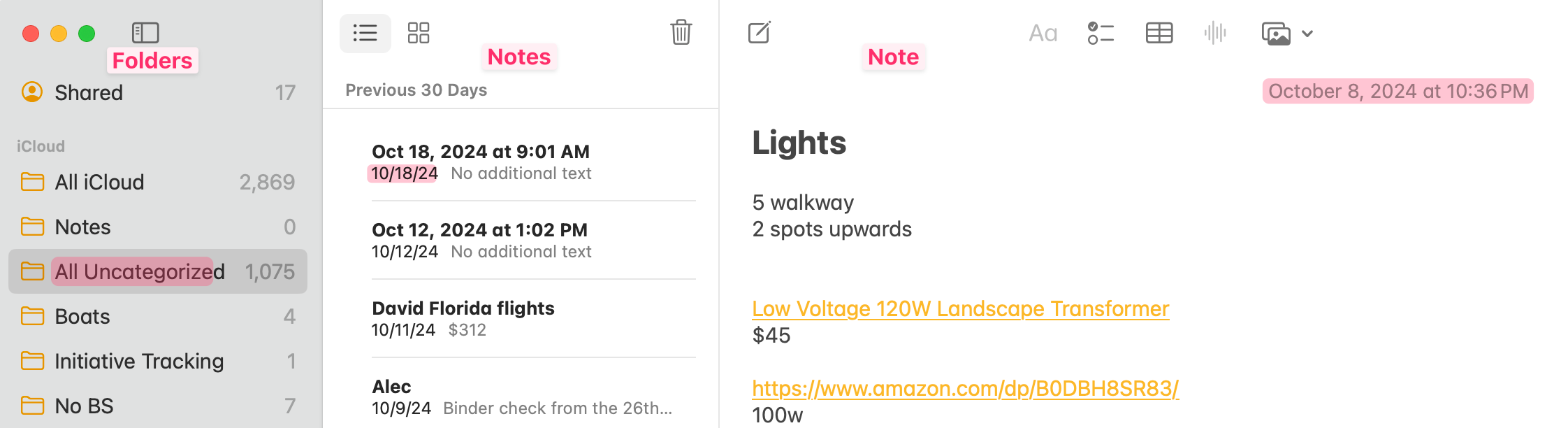
A quantitatively better method is what Apple created in the Finder and on iOS: navigation or column views. Attached is what things look like in Apple Notes.
At any time, I can switch to another folder more quickly. I simply move the mouse to that column, scroll the pane vertically, and click on the folder I need. To do this same action in an expand/collapse single view, I have to scroll the pane up until I see the containing folder of the note I'm on, collapse it, and then navigate to the desired folder. (Or make the decision, do I just scroll down until I see folders again?)
If several folders are "active" in the day I can immediately switch back and forth as the folder is highlighted and visible. In order to that with expand/collapse, I have to do the same thing as above.
My reference to what top level folders I have is always visible. With expand/collapse, when I need to create a new note, I need to collapse all the folders first before the full list is visible.
With a column view, there is enough room to see more than just a note title. You have room for excerpts, thumbnail image previews, last modified timestamp, etc. With expand/collapse, I have to actually open the note to get more context.
Some of these issues have menu options and UI elements added to make the situation better. So I understand a natural response would be to refer me to use them. But I've tried them and it's just not enough.
A better way to do this would be to throw out the old model and use what's current:
Don't show files in the folder hierarchy. Create a new column next to that to list all the files in the currently selected folder. This gives you more space where you can show more than just the title of the note. You can also show the first few line of text to give more context of what is in the note and you can add the modification date of the note. If there is an image early in the note, you could include a preview. This opens up so many possibilities.
In case one assumes I'm talking only about flat folder structures, this UI works with hierarchies. Open up Apple Notes to see how that works.